By: Jackson Aurik, Designer
When it comes to the dining experience, one part often leaves me feeling completely overwhelmed. The part in question? The menu. Most menus are, to me, nothing more than a list of endless options with no guarantee that the choices you make will be worth the amount of effort it took to make them.
To try to mitigate the risk of making the wrong choices, some people browse Yelp and Google reviews to find the best dishes for them, some read through the entire list of options a restaurant offers only to forget the first option by the time they get to the third one, while others choose to default to their waiter’s recommendations.
None of these options are ideal. Restaurant operators should want their customers to have a seamless experience within their app, without feeling like they have to go to another site or dine-in at their restaurant to find the best meal option for them.
Designing a digital application—especially one that users go to in search of something physical (in our case, food)—is no small feat. It requires finding the perfect balance between aesthetic and utility, while ensuring users don’t experience cognitive overload or feel overwhelmed by too many options. Here, we’ll take a closer look at these challenges and explore how to strike the perfect balance when designing a digital dining app.
Design Junk Overwhelm
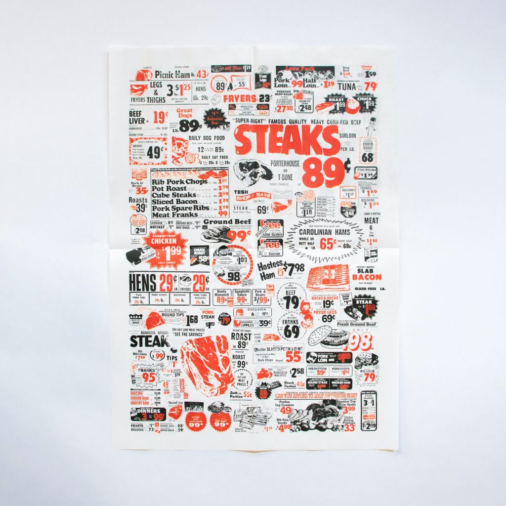
One of the biggest challenges in designing a digital dining app is finding the balance between information and decoration. On one hand, too much information can feel insipid and uninspired; on the other, too much decoration can make the entire experience so busy that users don’t want to interact with the app. As RJ Andrews writes in, Info We Trust: How to Inspire the World with Data, “If we get lost in aesthetics, our efforts to convey information may be reduced to mere decoration.”

The idea of “junk” in design refers to the presence of unnecessary or excessive elements that can create clutter and cognitive overload, leading to a negative user experience. Although these elements may be intended for aesthetic benefit, they ultimately detract from the functionality and effectiveness of the design. Good design should prioritize usability and simplicity while minimizing unnecessary or distracting elements. This connects to the idea, championed by Bauhaus, “form follows function”—cognitive overload leads to a confused user, who then becomes an unhappy user, and, ultimately, a frustrated user. This can put the entire dining experience in jeopardy, potentially leading to a loss in clients altogether. All that to say, both information and decoration have their place in smart, effective design.
Choice Overload
Another challenge in designing a digital dining app is giving the user too many options. This can be explained by the Paradox of Choice—the idea that having too many options can limit our freedom of choice, leading to dissatisfaction with our decisions. In such cases, users may experience cognitive overload, confusion, and choice overload, causing them to spend more time and effort making a decision than is necessary.
Understanding the Paradox of Choice is crucial for designers trying to create user interfaces that are intuitive, efficient, and satisfying for users. By taking steps to limit the number of options presented and simplify the decision-making process, designers can create interfaces that allow users to make informed choices without feeling overwhelmed.
Single-Choice Aversion
While the Paradox of Choice is a popular concept in the field of design, some studies suggest that having more options can lead to increased satisfaction with decision-making. The decoy effect, for example, states that having a third, often inferior, option can make people feel better about a decision. Additionally, the success of companies like Starbucks, which offers a wide array of customization options, seems to contradict the idea that having too many options automatically leads to dissatisfaction.
Furthermore, single-choice aversion suggests that people are less likely to choose an option if it’s the only one available because they have nothing to compare it against. In this sense, having more options can help people make more informed and satisfying decisions.
Barry Schwartz, the creator of the Paradox of Choice, himself acknowledges that the studies on the effects of options in decision-making are not conclusive. Instead, he suggests that designers should find the right balance between offering enough options to help people make informed decisions without overwhelming them with too many.

In conclusion, designing a digital dining application requires a complex balance between aesthetic and utility, the number of options offered, and avoiding cognitive overload. By prioritizing usability and simplicity, designers can create an intuitive and satisfying interface that helps customers make informed decisions. It’s important to find the right balance of options to optimize people’s satisfaction, and to not overwhelm them with too much information. Keep these principles in mind when designing your next digital app to ensure a successful and enjoyable user experience.


